Chapter 8. The Analysis View
The ReportServer analysis view is used both by the pivot mode of the Dynamic List (see Chapter 7.) and by OLAP reports. The handling is almost identical in both cases. The main difference is that for OLAP reports no additional configuration options can be made outside the analysis view. In the pivot mode of the Dynamic List, however, you as an end user define dimensions and measures and can restrict the dataset by means of prefilters, as well as create new attributes using calculated fields.
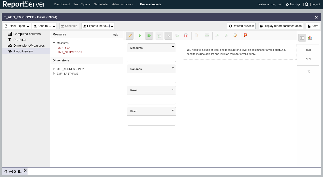
The analysis view consists of four areas. Centrally at the top is the toolbar. It provides various options for adjusting the view. On the left you will find the available dimensions and measures. On the right you can switch between data and chart mode. In the center, as usual, is the main view in which the data is prepared and displayed.
To understand the basic mode of operation, it is easiest to think in terms of a (multidimensional) cross-tab. The following table is a representation of the product survey data from Chapter 7. (Table ).
| male | female | ||||
| 20 - 40 | 40+ | 20 - 40 | 40+ | ||
| Electronics | TV | 3,7 | 4 | 3 | 4 |
| fridge | 3,75 | 4 | |||
| Groceries | cereals | 4 | 4 | 3 | |
| chocolate | 4,5 | 3,5 | 3,75 | 3 | |
Here, grouping attributes are arranged on both columns and rows. At the intersection of the grouping attributes, measures are aggregated. The grey-highlighted cell thus contains the average rating of male respondents over 40 for the product TV. Schematically, we can represent such a cross-tab as follows:
| column properties | |
| row characteristics | aggregations |
The basic operation now corresponds to building such a cross-tab. In the central view you see the areas and (we will discuss the filter area later). Here you distribute the desired dimensions, in the example above product category and sex. Simply drag the dimensions from the left with the mouse onto the columns or rows area. As soon as at least one dimension has been placed on both rows and columns, a cross-tab is displayed below (depending on the amount of data, this may take a few moments).
If, for example, we drag the attribute product category to rows and sex to columns, the following table is displayed.
| male | female | |
| Electronics | 3,8 | 3,7 |
| Groceries | 4 | 3,5 |
As the aggregation measure, if none has been explicitly selected, the first one in the list is used. To make this explicit, drag the desired aggregation (in the example) rating also to the columns or rows. If a measure is dragged to columns, the following view results:
| male | female | |
| rating | rating | |
| Electronics | 3,8 | 3,7 |
| Groceries | 4 | 3,5 |
The existing dimensions are displayed on the left as folders. A dimension can include one or more attributes. For example, the Time dimension can contain the attributes year, month, and day. To view the existing attributes, open the dimension folder.
In addition to the existing attributes, you will see an attribute for each dimension. You can drag this to rows or columns like other attributes. The attribute essentially describes the entire dimension and thus provides an additional aggregation level. In the example above, product category and product would form a common dimension. The product dimension would therefore be shown on the left as follows:
Produkt
   +---- (All)
   +---- Product category
   +---- Product
If you now place the attribute on rows and the measure rating on columns, the following result table is produced:
| rating | |
| All Products | 3,76 |
The (All) attribute now allows you to look deeper into the dimension, i.e., to add further aggregation levels. To display sub-levels of the dimension, left-click on the label "All Products" in the displayed cross-tab and select from the context menu. This causes the display to change as follows:
| rating | ||
| All Products | 3,76 | |
| Electronics | 3,75 | |
| Groceries | 3,77 | |
You can now continue to drill down into the dimension, or conversely remove breakdowns.
In the following, we present the options of the toolbar in detail. From left to right you will find:
| Execute query | Executes the query currently configured. As a rule, queries are executed automatically as soon as a change has been made (see the next tool). If this option is not enabled, you can start the query manually here. |
| Automatic execution | By default, the view is reloaded as soon as a change is made. With large data sets, this can have a noticeable impact on performance. |
| Hide empty parent members | Hides rows in the result list that have no value on the current aggregation level. |
| Suppress "Null" | Hides empty cells in the result. |
| Swap axes | Swaps columns and rows. |
| Show MDX | Displays the associated "MDX" (Multidimensional Expressions). |
| Zoom into table | If this function is enabled, click the desired table cell and navigate to the table element you want to select. |
| Drill across | Drills across the entire cell. |
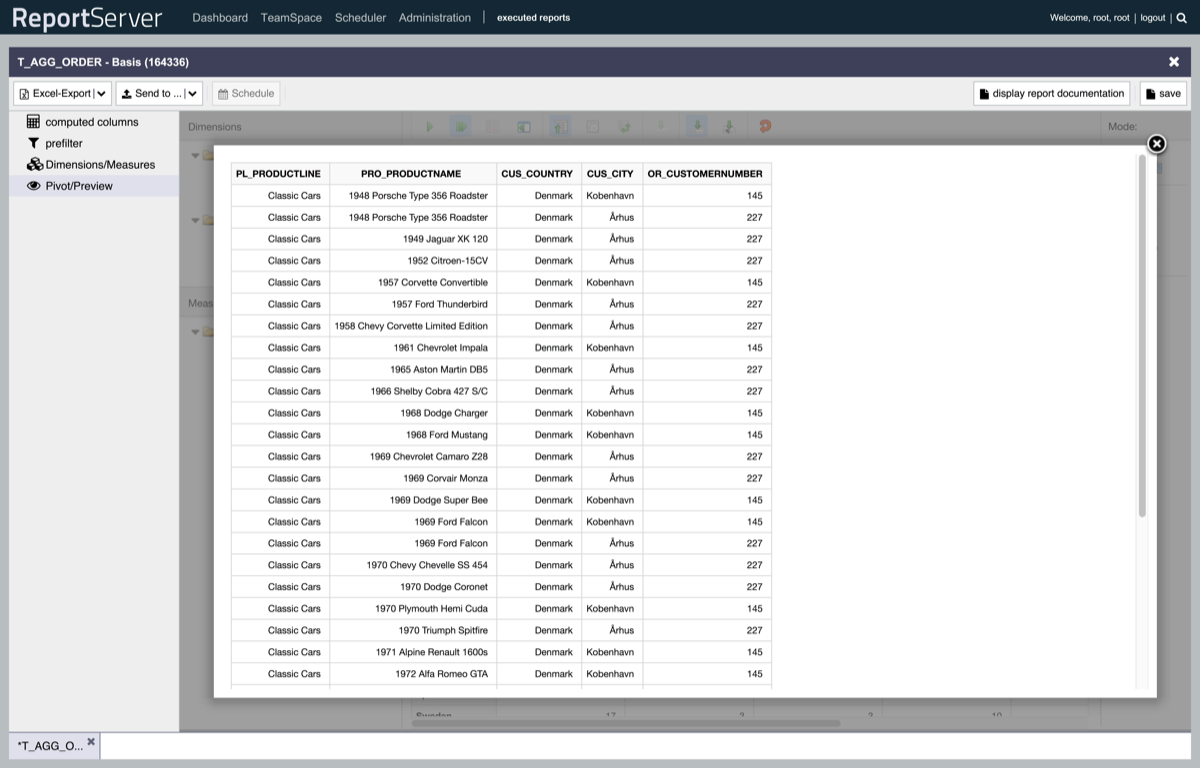
| Drill through | Drills through to the underlying records for the selected cell. |
| Export drill (CSV) | Exports the result of a drill operation. See also Section 8.6. |
| Switch to MDX mode | Displays the associated "MDX" and allows you to edit it. |
| Reload | Reloads the analysis view. This is particularly important when working in the pivot mode of the Dynamic List in order to apply changes made in other aspects (e.g. adding measures and dimensions) to the analysis view. |
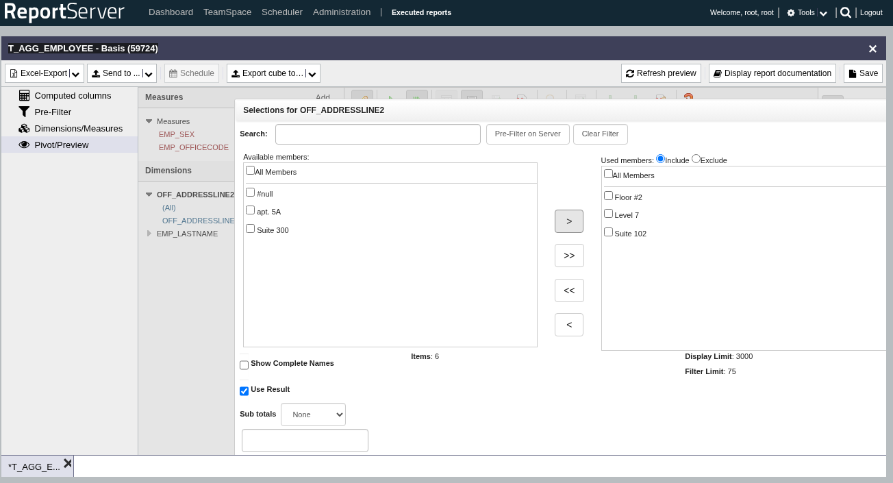
If you have dragged an attribute to the row or column area, you can define additional filters for it. Double-click the element to open the filter dialog. The filter dialog is structured similarly to the one known from the Dynamic List. If you are working in the pivot mode of a Dynamic List, we recommend using the Pre-Filter aspect for complex filters or when filtering on attributes with many distinct values.
If you want to filter on dimensions that should not appear in the result set, you can drag them to the filter area.
If you have dragged an attribute to the row or column area, you can activate sorting for this attribute using the arrows shown there (next to the magnifying glass, in the toolbar).
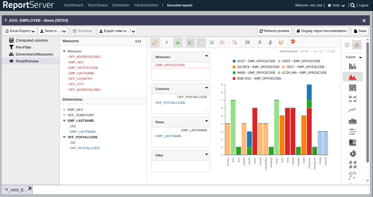
Instead of displaying the result as a cross-tab, you can switch to chart mode using the right-hand sidebar. A wide range of chart types is available. Of course, you can also export a report in analysis mode as a chart or embed such a chart on your dashboard.

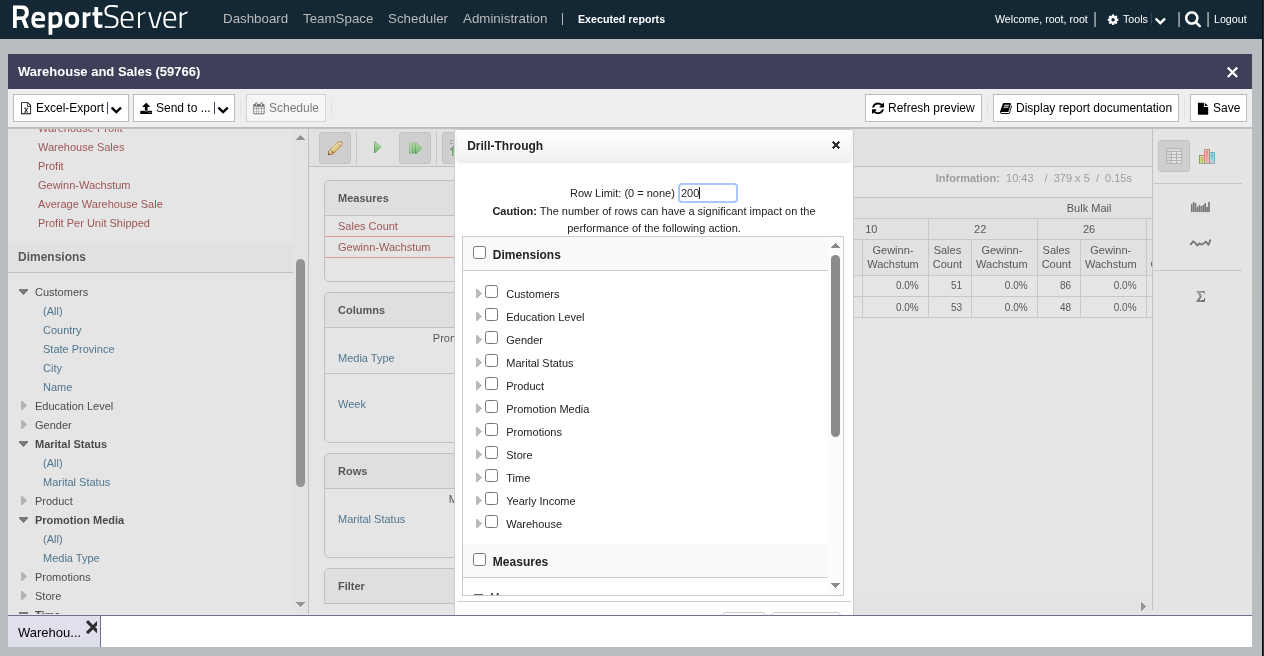
The drill function allows you to display the records underlying an aggregation result. To do so, select the drill tool in the toolbar and then click an aggregation result. In the following dialog, you can adjust the output by selecting the dimensions and measures to be returned. In addition, you can limit the maximum size of the result set. Please note that large result sets can have a significant impact on system performance and should therefore preferably be executed as an export (using the Drill Export button in the toolbar).
