Adding Charts to your ReportServer Dashboard
Recently I’ve been asked what the easiest way is to add nice looking charts to a ReportServer dashboard. There are, of course, many ways to achieve this. You could for instance create a report in Jasper or Birt and simply embed the PDF. In this blog post we look at what you can do with the dynamic list and a few lines of JavaScript.
ReportServer’s dynamic list offers many export formats some of which, such as JSON, make it easy to use the returned data directly from within javascript. We are going to use the jplot library, a charting extension to the popular jquery library, to create just a very simple pie chart.
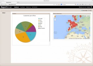
The RerportServer’s demo data comes with a dynamic list on top of the customer data aggregate: T_AGG_CUSTOMER. This table contains all data relevant to specific customers. We are going to visualize the number of customers per office using a simple pie chart.
The first step is to get the data. ReportServer allows to export reports directly via the url
http://SERVER:PORT/reportserverbasedir/reportserver/reportexport
You can access a particular report via its id or via its key (in this case ensure that it is unique). Suppose you have a report with the key myreport then you can export the report to say PDF by calling
http://SERVER:PORT/reportserverbasedir/reportserver/reportexport&key=myreport&format=pdf
There are two options to proceed, either create a variant first, that accesses the data we need for the chart, or use the base report and access the data via the URL directly. We are going for the second option here. Assuming the customer report has the key “customer” we can access the data via the following URL
http://SERVER:PORT/reportserverbasedir/reportserver/reportexport&key=customer&c_1=OFF_CITY|country&c_2=CUS_CUSTOMERNAME|count&agg_2=COUNT&format=json
You can test this on our demo system using the following URL (when prompted, login as demoadmin/demoadmin)
Next we are going to create our pie chart. For this, log into your ReportServer and go to the dashboard. Create a new dadget of type static html. Following is the code needed to create a simple pie chart using the above data:
<html>
  <head>
    <script language="javascript" type="text/javascript" src="http://www2.datenwerke.net/files/blog/js/jqplot/jquery.min.js"></script>
    <script language="javascript" type="text/javascript" src="http://www2.datenwerke.net/files/blog/js/jqplot/jquery.jqplot.min.js"></script>
    <script class="include" type="text/javascript" src="http://www2.datenwerke.net/files/blog/js/jqplot/plugins/jqplot.pieRenderer.min.js"></script>

    <link rel="stylesheet" type="text/css" href="http://www2.datenwerke.net/files/blog/js/jqplot/jquery.jqplot.min.css" />
  </head>
  <body style="background-color:#fff">
    <div id="chart1" style="height:500px;width:500px; "></div>
    <script type="text/javascript">
    $.getJSON( 'http://rstest.datenwerke.net/reportserver/reportexport?id=22&c_1=OFF_CITY|country&c_2=CUS_CUSTOMERNAME|count&agg_2=COUNT&format=json', function(json) {
       var data = [];
       $.each( json, function( key, val ) {
          data.push( [val.country, Number(val.count)] );
       });

       var plot1 = jQuery.jqplot ('chart1', [data], {
           title: 'Customers per office',
           seriesDefaults: {
               renderer: jQuery.jqplot.PieRenderer,
               rendererOptions: {
                   showDataLabels: true,
                   dataLabels: 'value'
               }
        },
        grid: {
            background: "#fff",
            borderWidth: 0,
            shadow: false
        },
        legend: {
            show: true
        }
     });
   });
   </script>
  </body>
</html>
There are three basic parts to this script. The first is the head section of the HTML, where we load the required javascript libraries. Next is
$.getJSON( 'http://rstest.datenwerke.net/reportserver/reportexport?id=22&c_1=OFF_CITY|country&c_2=CUS_CUSTOMERNAME|count&agg_2=COUNT&format=json', function(json) {
       var data = [];
       $.each( json, function( key, val ) {
          data.push( [val.country, Number(val.count)] );
       });
});
which uses jquery to load the json data and to create a data array that is needed for jqplot. Finally we have the actual plotting of the data.
var plot1 = jQuery.jqplot ('chart1', [data], {
    title: 'Customers per office',
    seriesDefaults: {
       renderer: jQuery.jqplot.PieRenderer,
       rendererOptions: {
          showDataLabels: true,
          dataLabels: 'value'
       }
    },
    grid: {
       background: "#fff",
       borderWidth: 0,
       shadow: false
    },
    legend: {
       show: true
    }
});
If all went well, you should see a pie chart similar to this.